Evolution of New Rector Logo
After 7 years since the first Rector commit, we have a new logo!
Today, we're proud to share a streamlined, smooth, and modernized version of the Rector logo. Similar to a project upgrade, the final version looks great, but the journey is the destination. Did you know it took 40 commits, 5 sketched paper pages, and 3 months to get there?
Today, I'd like to share the backstory with you.
Rector started as a pet project to ease my daily work. I asked a friend to make a logo, and he helped me.
The job description was "house, left part old, right part new". I wanted to show the main purpose of reconstructor (original name) = a code reconstruction. I haven't told this to anyone, but it represents the house in Liberec where I grew up with my family. My father used to reconstruct it all the time. The result was the logo we all know:

It was good for the time being. But Rector grew, a pet project turned into full-time work, company, a book and regular conference talks. A logo with 30 colors+, gradients, and tiny details was impossible to use in printed material. The need for a new version was imminent.
We have been thinking of a new Rector logo since 2020. We wanted a new logo to land on Rector 1.0 live release in Laracon 2024, Amsterdam. But many of the new features presented in the talk had to be delivered first. After the Rector 1.0 release, we received a few offers from external designers, yet we could not find a good fit with any of them.
We joined Open Source Pledge this year to spread the "giving back to open-source is normal" message. A couple of weeks after joining the pledge, we got a surprise message: "Oh, your logo will be on Times Square." The only problem was that we had to stitch up a new, temporary, simple logo within a week.
"Just strip down every detail; make it simple". This was the result:

Butter, but still not pretty to watch. It was the last nail in the coffin.
We've decided to land a new logo before Rector 2.0 is out.
It's an Upgrade Time... of Logo
I wanted to keep the house, as it's a part of Rector's DNA. I wanted to keep the left "shady" and the right "modern" side. The logo should represent modern, streamlined change as we do with legacy projects that are perceived as impossible to upgrade.
The logo must be:
- simple = 2 colors maximum
- modern with curves
- easy to print and spot in a tiny version (favicon)
- A/B tested on users, so we get the idea of how developers see our identity
We've decided to make as many iterations as needed until we're sure it's the right one.
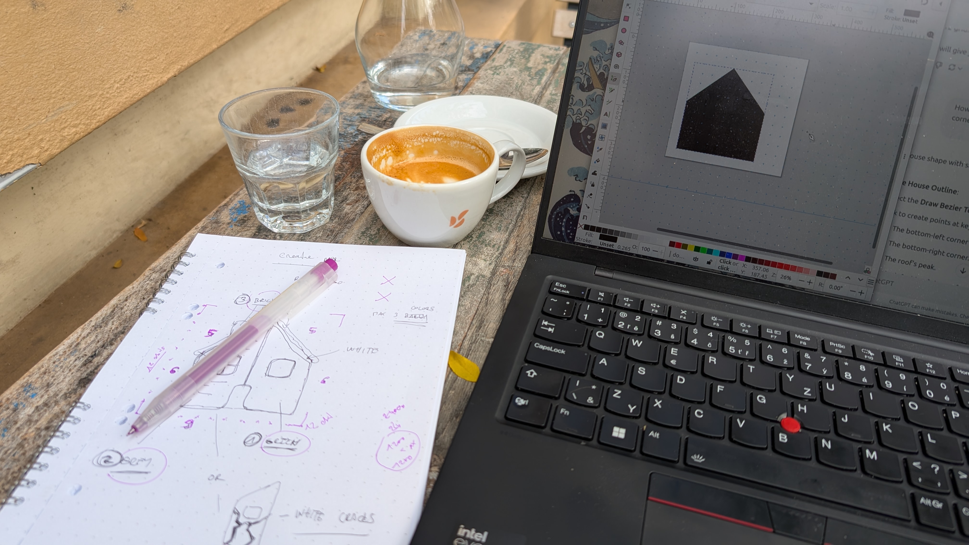
2nd iteration came up with an idea: "Let's use CI colors, the left for warnings, the right for a successful pass.":

What was the feedback?
- "The yellow/orange colors do not contrast enough."
- "There are too many lines and details
- "There are basically 4 colors."
- "What are those horizontal lines?"
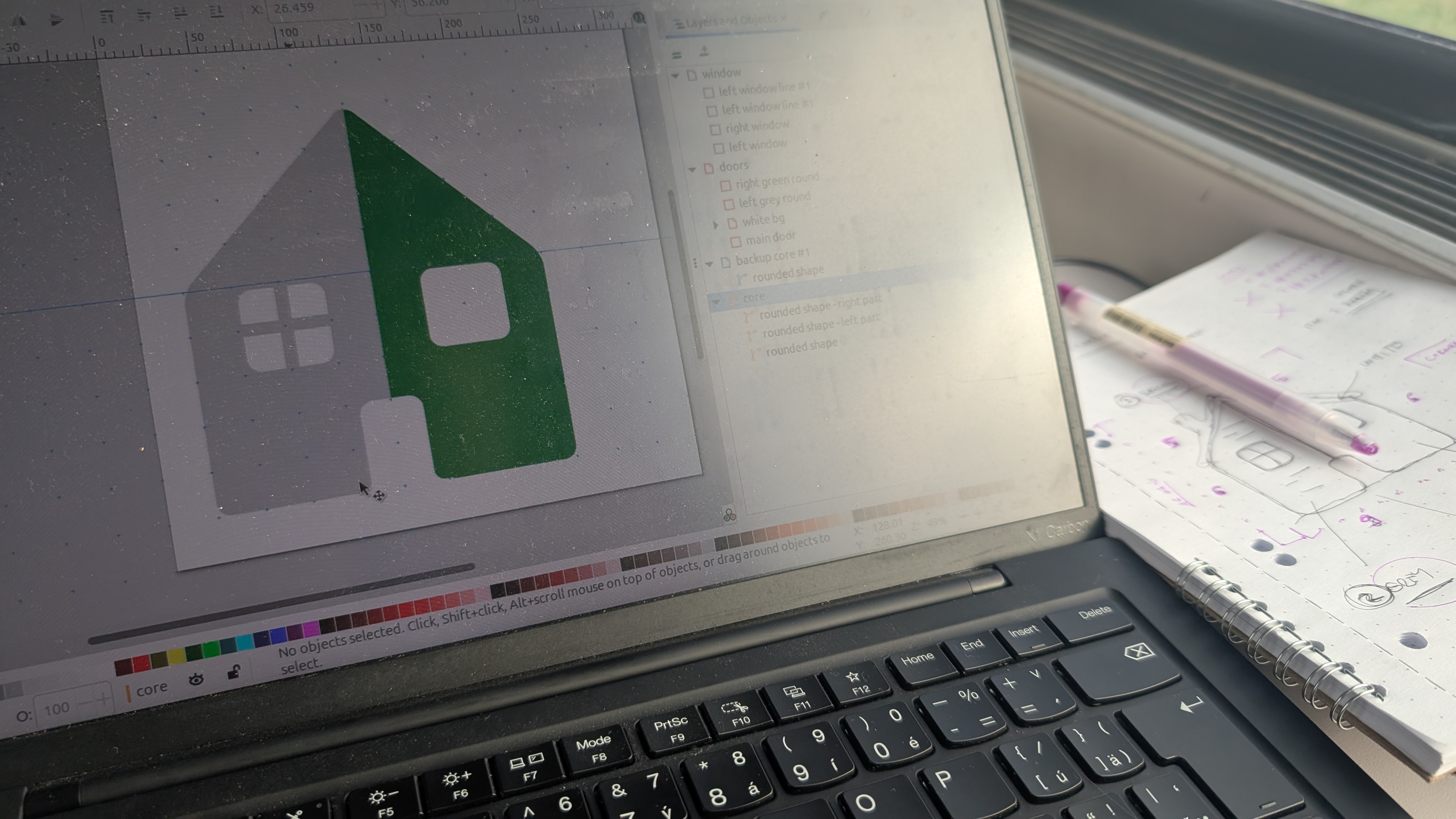
On 3rd iteration we've found a great color palette we fell in love:

What was the feedback?
- "Colors look much better"
- "When it's small, there are still many details"
- "Is the roof flying?"
- "remove windows, remove doors - people will get it"
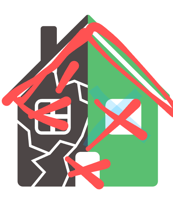
We've integrated feedback, and in 4th iteration, we removed all the details but cracks:

What was the feedback?
- "House looks neat."
- "What are these lines?"
- "Is that the homepage icon?"
We don't want to make another homepage icon. We want to make a logo that represents Rector. We've removed the confusing lines and tested various "R" fonts.
On 5th iteration, we felt we were getting closer.
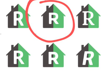
What was the feedback?
- "2 in the middle"
- "2 and 5"
- "The roof is tiny, though."
We added a roof testing for 6th iteration
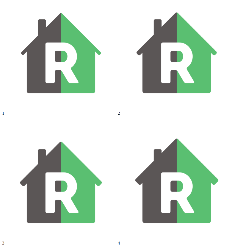
What was the feedback?
- "2 and 3."
- "3 or 4."
- "4 but with bigger chimney."
We went with version 3 and made the chimney slightly bigger. Time to test on production!
Final Version
We silently pushed the logo on our homepage to see reactions in the wild. It was great to see people noticing the change and giving us feedback.
Here is the final version:


New Rector Book Cover
While at it, we've designed a new cover for the Rector book, so it runs Rector 2.0 not only inside but outside as well.
The 5-iteration journey looked like this:

It's been a long but adventurous journey. Rector is built on the PHP community, so we've really enjoyed including the community in making the new logo the best version possible.
We're proud of the final result, and we hope you like it, too.
Happy coding!